
What happened
When people think about the past, they tend to spend more. Studies show that a simple memory prompt can increase spending and donations. The reason is social connection. Feeling linked to others makes new choices feel safer. Big consumer studies echo this. Many shoppers say they like products that “remind them of the past.” Food, drink and media brands have used this pull to good effect. That is the core of nostalgia marketing.
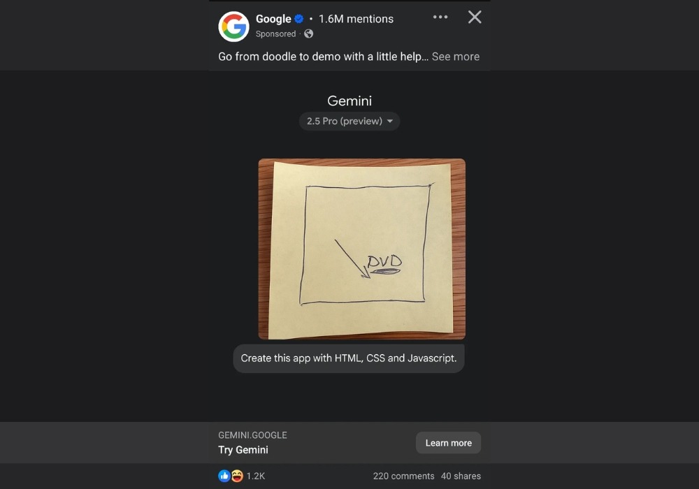
Below, Google shows this in public. A hand-drawn “DVD” on a sticky note that becomes a working demo. The output is a bouncing screensaver made with HTML, CSS and JavaScript. That familiar cue is nostalgia. The point is not the DVD itself. It is that a known memory can make advanced tech feel simple and safe to try.
Why it matters now
Your product/service may feel new or risky at first glance. Buyers want a quick reason to trust it. Nostalgia marketing borrows trust from a memory people already know. That can mean more trials, less explaining and a higher price customers accept. If Google leans on this move, you can too.
The move to try
Goal: make a new feature feel safe enough to try.
- Spot the wobble → write the exact moment people hesitate.
Examples: “Connect my bank”, “Share my data with AI”, “Install an add-on”. - Pick one shared memory → choose a nostalgia cue your users already know.
Options: Google Doc “Share with link” for “simple invite access”, AirPods pairing for “one-tap setup”, iPhone pinch-to-zoom for “easy control”, Spotify playlists for “save now, tweak later”, a classic screensaver for “gentle waiting”. - Write one plain line → link the cue to the task.
Template: “Like [memory], but for [your task].”
Examples: “Share-link access, Google Doc–style, for early users.” “Pair your bank, AirPods-style.” “Gentle waiting, screensaver-style.” - Place it where nerves spike → landing subhead, one in-product tooltip at the friction point, and next to pricing or permissions if that is where people stall.
- Test the change → run a simple A/B for seven days.
Version A: your current copy.
Version B: the “[memory] for [task]” line with one small matching visual.
This is your light nostalgia wrapper.
This uses two tools from Quantum Studios: Attention Shift to frame the new thing through a known memory, and a Friction Map to target the exact stall points.
What to measure
Pick any two. Run for 7 days. Compare before vs after.
- Stayed longer? More time on the page.
- Left less? Lower early exits.
- Clicked next? More taps on “Learn more”, “Contact”, or “Book”.
- Fewer drop-offs? Less quitting during your nostalgic element.
Watch outs
- One memory. One sentence. One small visual.
- Choose a cue your users actually know.
- If it needs a long explanation, simplify and retry.
Proof box
- Live example: Google’s doodle-to-DVD demo uses nostalgia to make AI feel safe.
- Lab effect: Nostalgia can increase spending and donations by boosting social connection.
- Market signal: Many people prefer brands, products and services that “remind them of the past.” This is nostalgia marketing in practice.