The Work
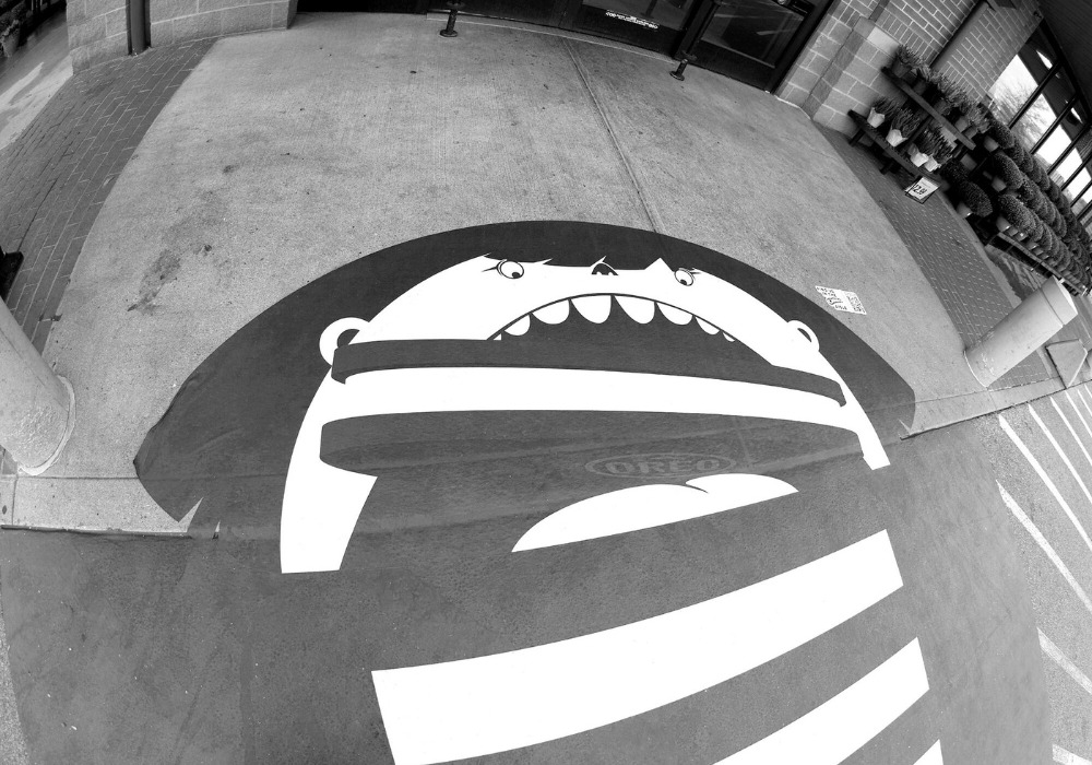
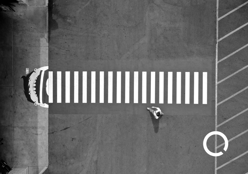
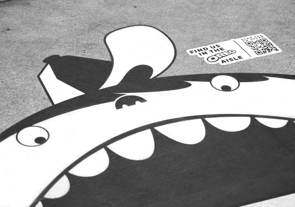
Oreo and VML took the brand off the shelf and onto the ground outside select Kroger stores. Crosswalk stripes became stacks of cookies. Illustrated faces chomped the “stripes” mid-step. A QR code on the artwork opened a limited in-store offer, so a quick scan at the kerb became a reason to pick up a pack inside. It’s playful, obvious and placed precisely where a small nudge can change what lands in the trolley.
The activation sits under Oreo’s creative commerce push: use creative to drive a measurable sale, not just a smile. It launched in specific markets around Kroger locations and pushed traffic to a dedicated experience at oreo.com/oreowalksfor the offer redemption.
The Why
What type of marketing is this?
Shoppable out-of-home. It blends classic outdoor attention with an immediate path to purchase, using a QR code to bridge media and shelf in one move. In trade terms, it’s creative commerce at the point-of-sale perimeter. In shopper terms, it’s a friendly shortcut: “See cookie, scan code, get a deal, grab a pack.”
Why does it work?
- Placement beats promise. The ad sits where a decision happens. You aren’t asking someone to remember an offer later. You’re helping them act now, within metres of the aisle. Micro-case: a parent scanning with one hand while steering a trolley with the other, then tossing in an Oreo on the way past.
- Familiar shape, zero learning curve. The cookie’s rings and the crosswalk’s stripes snap together at a glance. That instant recognition buys the second you need for a scan.
- Offer as payoff. A scan without a clear benefit dies on the kerb. Here, the QR unlocks a concrete in-store deal, so curiosity ladders into a purchase.
The Way
Mechanic 1: Show up at the decision moment
Treat decision points as media. Think homepage hero, app launch screen, product page, checkout, lobby screen, parcel insert, confirmation email. Place the trigger where choices are made.
Mechanic 2: Make the cue unmistakable
Use one clear brand cue and one short line next to the scan/tap/click. One action, one reward. Avoid extra copy that competes with the call to act.
Mechanic 3: Close the loop to action
Send people to a context-aware destination: prefilled basket, nearest location, booking slot, trial activation, download, or callback. Connect identifiers so scans/taps/clicks, redemptions and orders map end to end and can be compared with a control group.
Mechanic 4: Remove friction in two taps or fewer
Load fast. Show one primary button. Support native wallets, deep links and autofill. Offer “save for later” or “send to me” if the moment is rushed.
Mechanic 5: Build for the channel and maintain it
For physical touchpoints, use durable materials and a refresh schedule. For digital, keep links live, tags accurate and pages stable. If the trigger degrades, the journey breaks.

Measurement
Attention
Count how many people noticed and interacted. Track scans, taps or clicks. Break it down by where it ran and when it ran.
Behaviour
See what people did next. Did they redeem, start a trial, add to basket, or begin a booking? Measure how long it took from the first tap to that step.
Commercial
Did more people convert than usual? Compare with a similar group who did not see the prompt. Track orders, revenue, average order value, and cost per extra action.
What to do next
- Put your most recognisable cue at a real decision moment and pair it with a specific, plain-English reward.
- Write the offer in six clear words people can grasp at a glance.
- Track the full journey —trigger → action → outcome — and publish the lift against a proper control.