
Overview
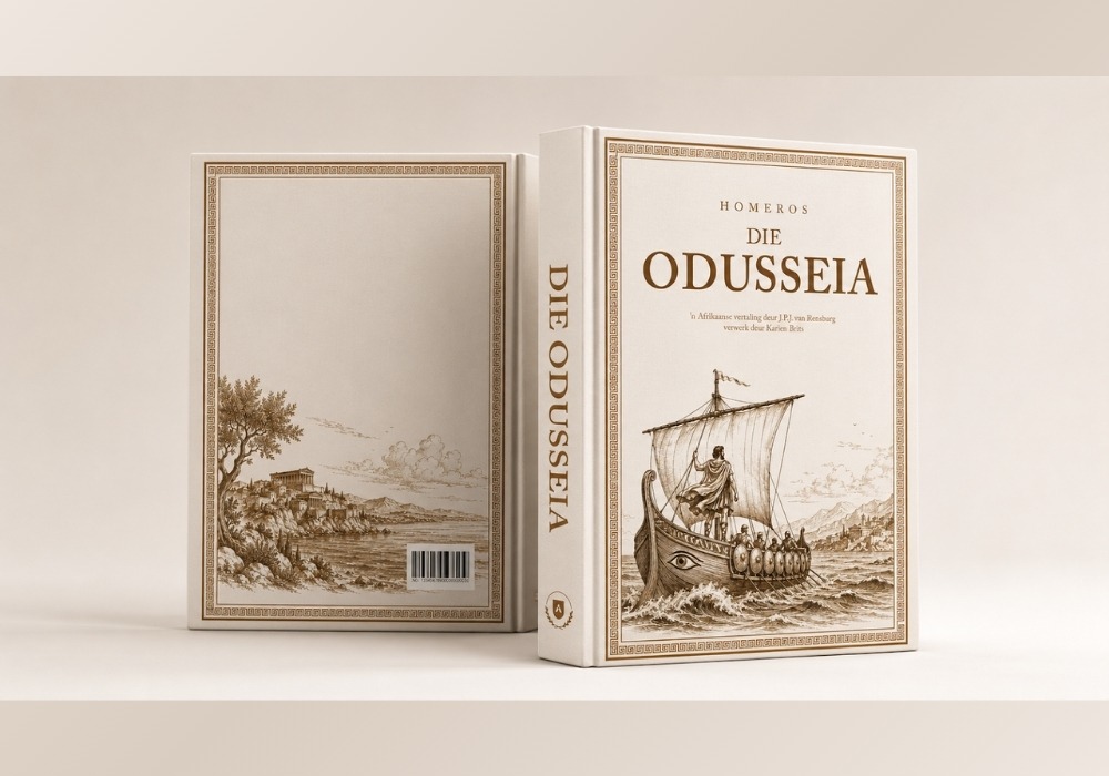
Quantum Studios was commissioned to develop cover design concepts for Die Odusseia, an Afrikaans adaptation of Homer's legendary epic, The Odyssey.
The project required balancing literary heritage with contemporary design, creating a visual identity that would honour one of history's most influential works while appealing to modern readers, collectors, and academics.
Through strategic design exploration, we developed multiple creative directions that reflected the timeless nature of the story while positioning the publication as a premium addition to any bookshelf.
The Challenge
Few literary works carry the cultural weight of The Odyssey. Any visual interpretation needed to respect the significance of the original text while creating a compelling physical product capable of standing out in today's publishing environment.
The challenge was not simply to design a book cover, but to visually communicate themes of adventure, discovery, mythology, perseverance, and legacy through a carefully considered design system.
The final concepts needed to feel authentic to the classical origins of the work while remaining relevant to contemporary readers and collectors.
Our Approach
We began by exploring the core themes of the epic itself: the journey, the sea, heroism, and the enduring legacy of ancient Greek storytelling.
This strategic foundation informed two distinct creative directions.
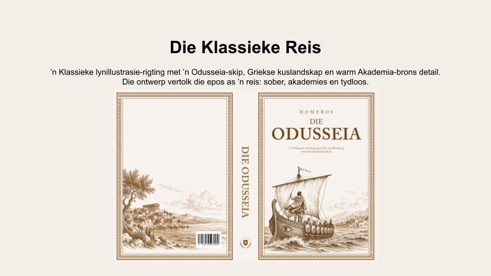
The first concept, Die Klassieke Reis, embraced traditional line illustration, depicting an Odyssean ship navigating a classical Greek landscape. Warm bronze tones, detailed illustration work, and elegant typography were used to create a timeless, scholarly aesthetic that reflected the narrative's historical roots.
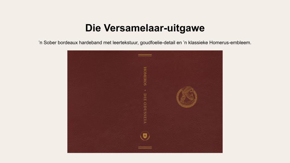
The second concept, Die Versamelaar-uitgawe, focused on creating a premium collector's edition. Rich bordeaux tones, leather-inspired textures, gold foil detailing, and a refined Homeric emblem elevated the book into an object of craftsmanship and prestige, appealing to collectors and literary enthusiasts alike.
By developing multiple strategic routes, we provided the client with options that served different audiences while remaining faithful to the essence of the work.
What We Delivered
- Book cover design concepts
- Creative direction development
- Typography selection and hierarchy
- Premium publishing design
- Classical illustration integration
- Collector's edition concept development
- Print-ready visual presentation mock-ups
- Design rationale and concept positioning
The Outcome
The resulting concepts transformed a centuries-old literary masterpiece into a visually compelling publication suitable for modern audiences.
By combining classical influences with contemporary publishing standards, the designs created a strong visual identity capable of attracting readers, collectors, academics, and literature enthusiasts alike.
The project showcased how thoughtful design can bridge the gap between cultural heritage and modern publishing, ensuring that timeless stories continue to resonate with new generations.
Why It Matters
Great book design does more than protect the pages inside. It shapes first impressions, communicates value, and creates an emotional connection before a single word is read.
This project demonstrates Quantum Studios' ability to translate complex ideas, cultural heritage, and literary significance into design systems that are visually striking, strategically considered, and commercially effective.
Whether developing publishing materials, brand identities, or premium print assets, our approach remains the same: create work that captures attention, communicates meaning, and leaves a lasting impression.