



Explore the full piece of work by clicking the images above.
Overview
Quantum Studios partnered with Dimpels + Duimpies Kleuterland to develop a complete brand identity that reflects the warmth, creativity, and nurturing environment at the heart of early childhood education.
The project extended far beyond logo design, encompassing a comprehensive visual identity system that could be applied consistently across marketing materials, social media, signage, merchandise, and everyday communication.
The result was a vibrant and engaging brand that resonates with both children and parents while providing the school with a professional and recognisable presence.
The Challenge
For parents, choosing a preschool or nursery school is one of the most important decisions they make. First impressions matter.
Dimpels + Duimpies needed a visual identity that would immediately communicate trust, care, creativity, and fun while standing apart from other educational institutions competing for attention.
The challenge was to create a brand that appealed to young children through playful visuals while simultaneously reassuring parents that their children would be cared for in a safe, welcoming, and enriching environment.
Our Approach
We began by developing a visual identity centred around curiosity, imagination, and learning through play.
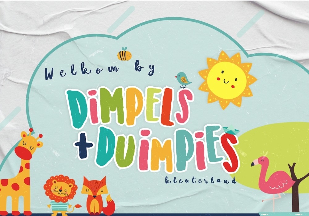
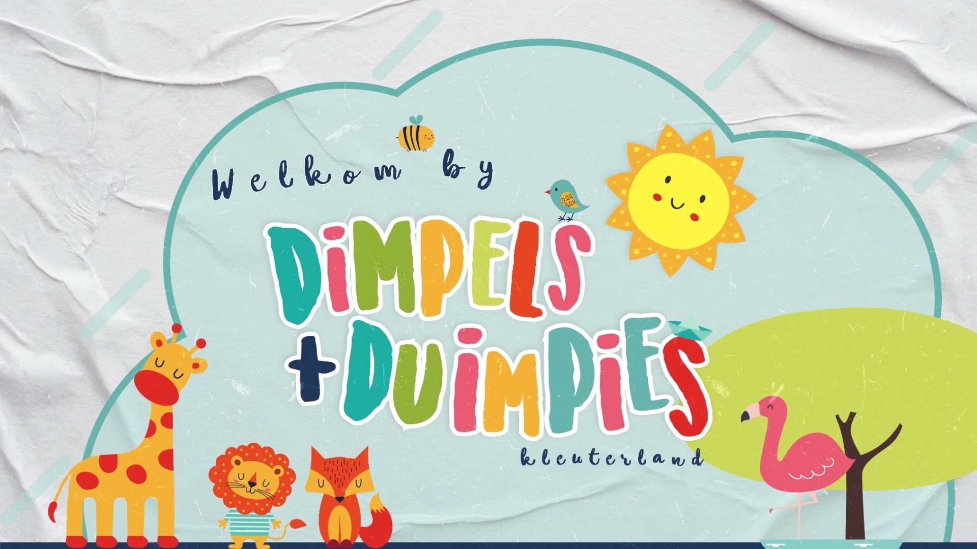
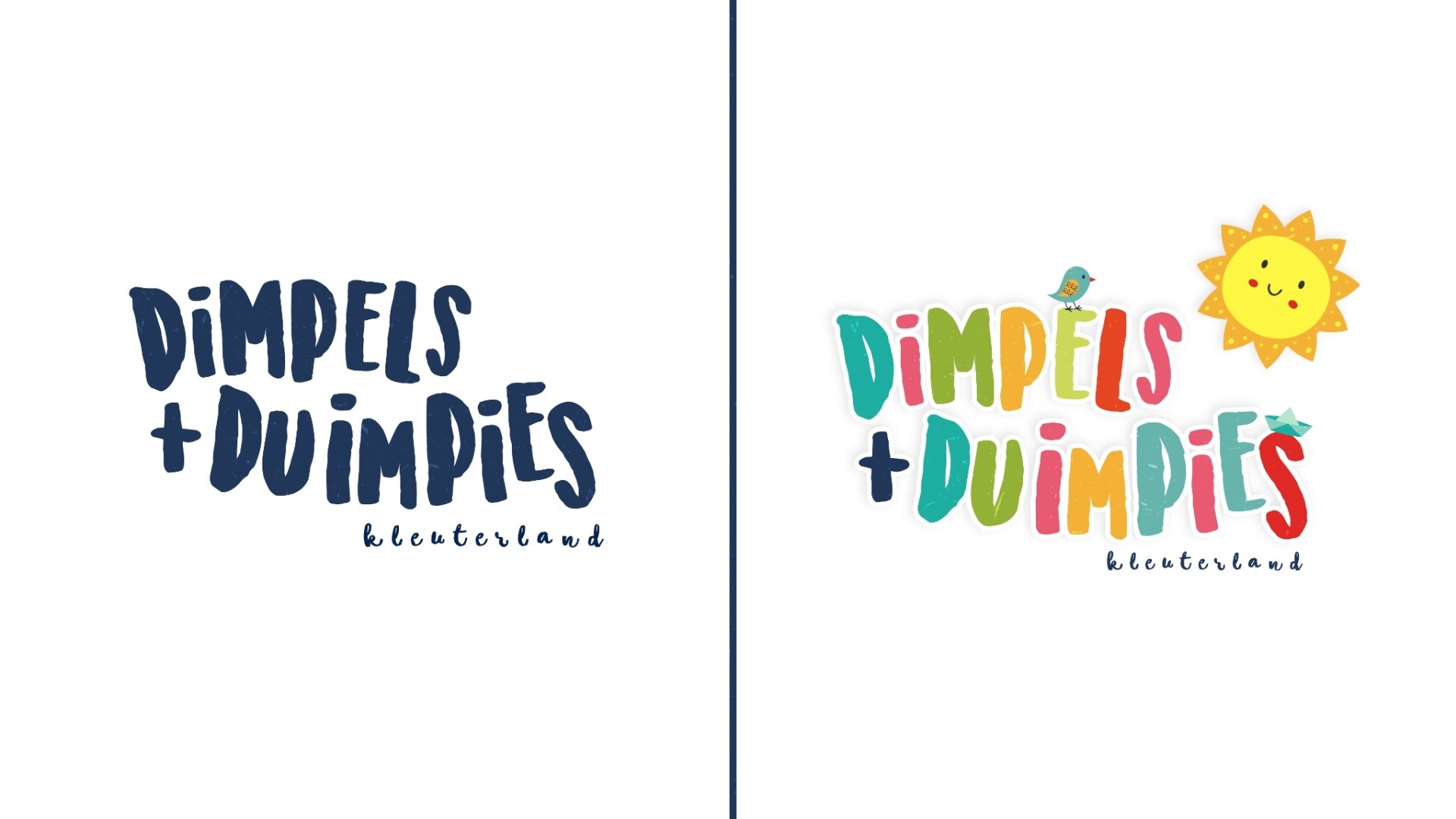
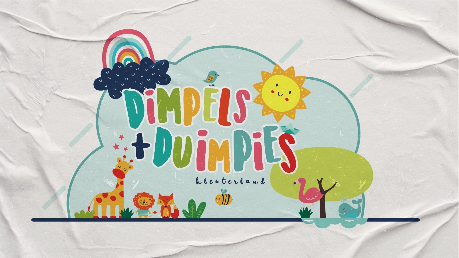
The logo system was designed to feel approachable, energetic, and child-friendly, combining playful typography with bright colours and cheerful illustrative elements. The identity was intentionally crafted to evoke a sense of wonder and positivity from the very first interaction.
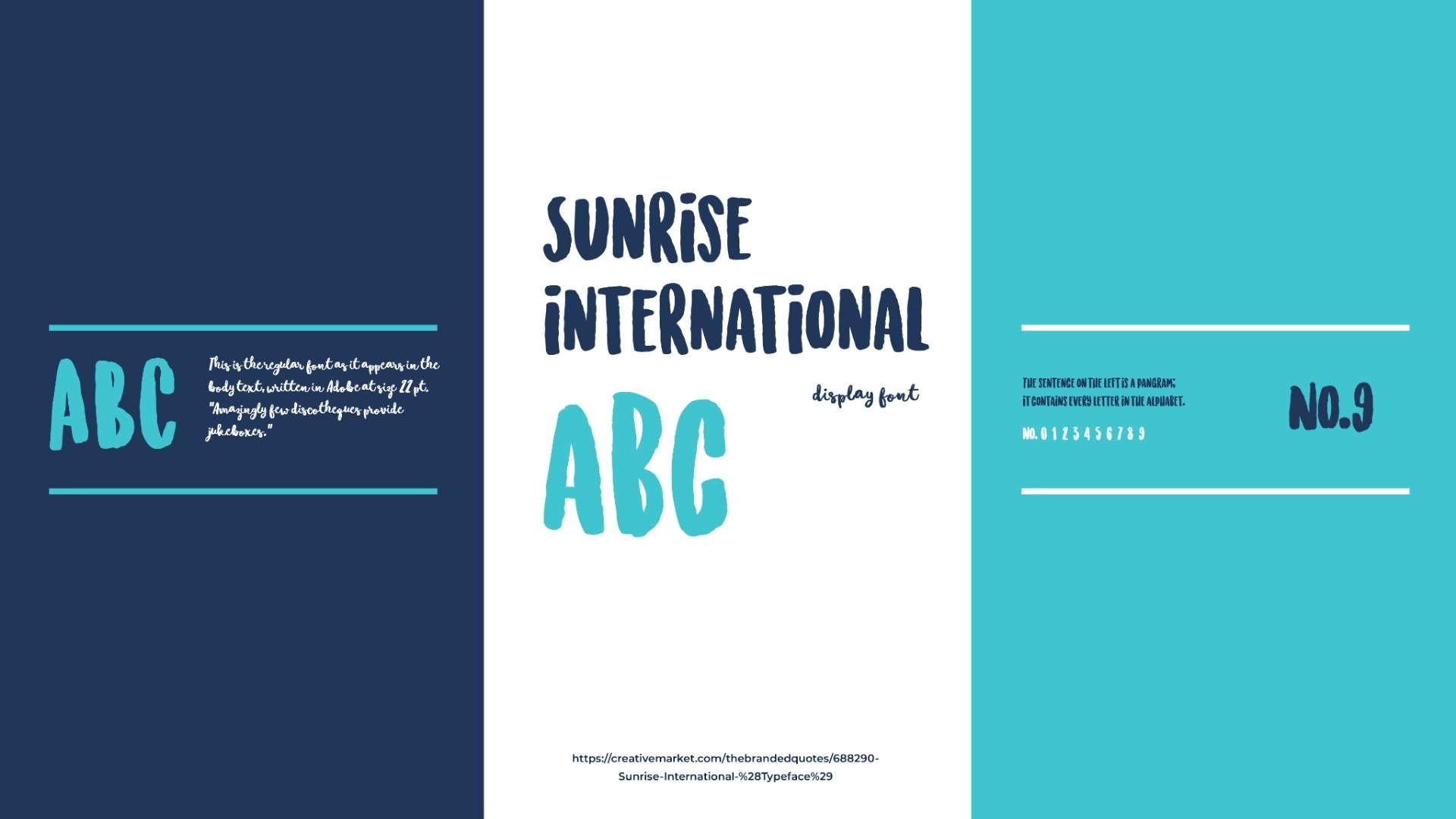
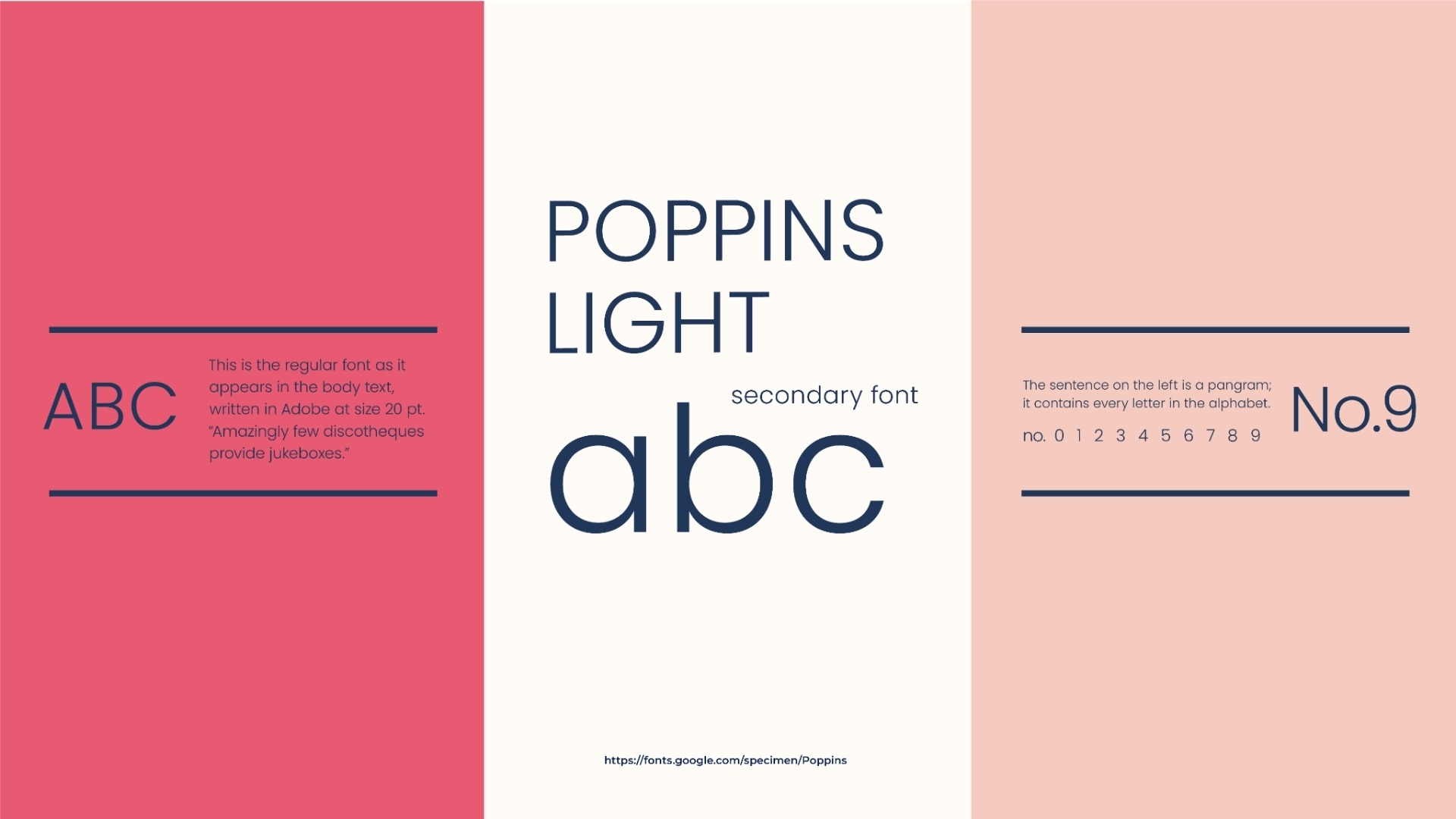
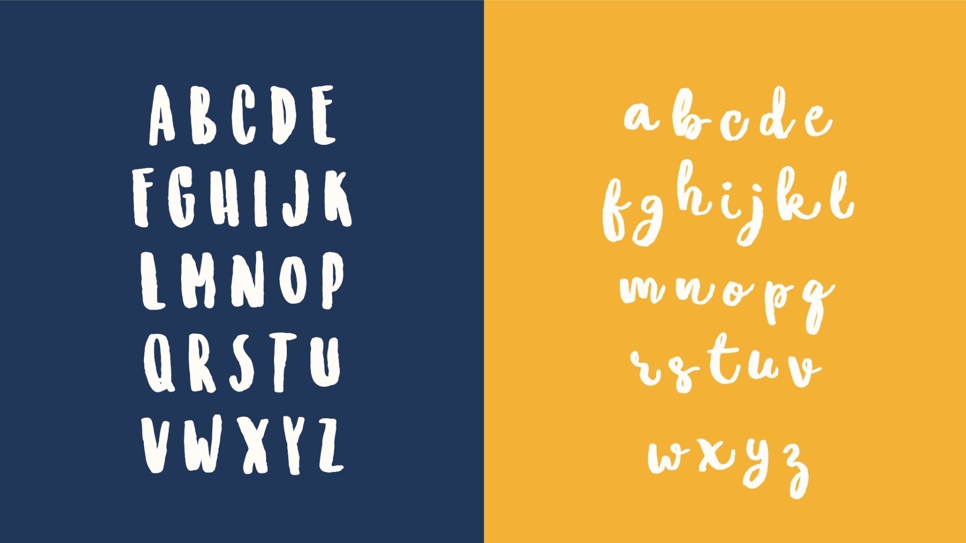
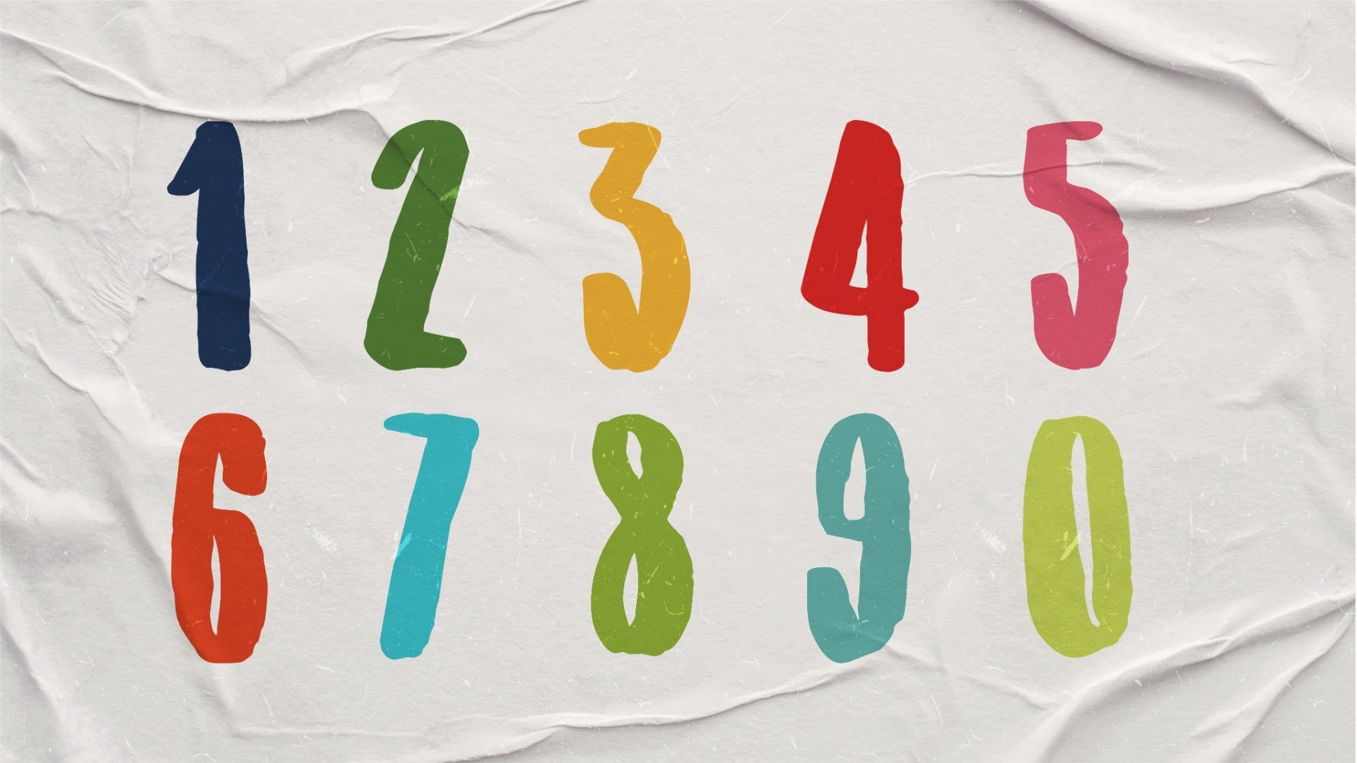
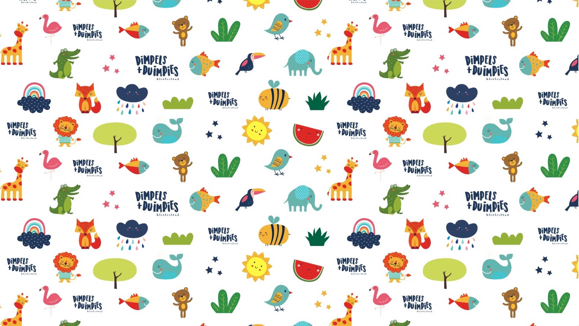
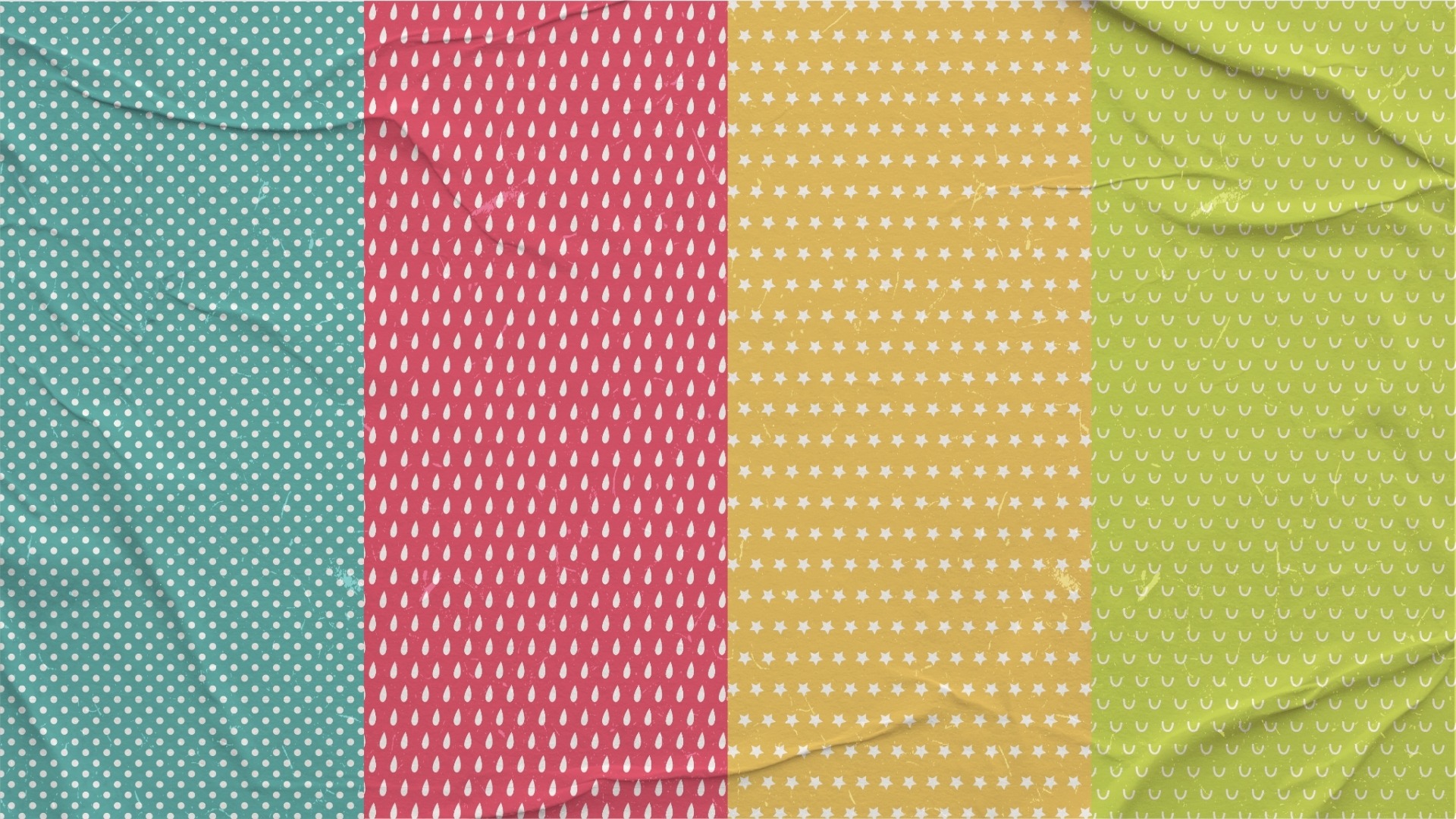
To support long-term brand consistency, we created a complete visual language that included a carefully curated colour palette, typography hierarchy, custom illustrations, branded patterns, and supporting graphic elements.
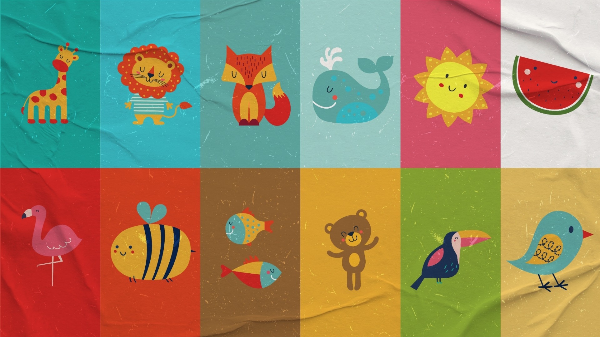
A collection of friendly animal characters, nature-inspired illustrations, and playful design assets were developed to create a distinctive personality that could be used throughout the school's communication and marketing materials.
The result was a scalable brand system capable of growing alongside the school while maintaining a consistent and memorable identity.
What We Delivered
- Brand strategy and visual identity development
- Primary and secondary logo design
- Colour palette development
- Typography selection and hierarchy
- Custom illustration assets
- Character and mascot design
- Branded pattern creation
- Social media post templates
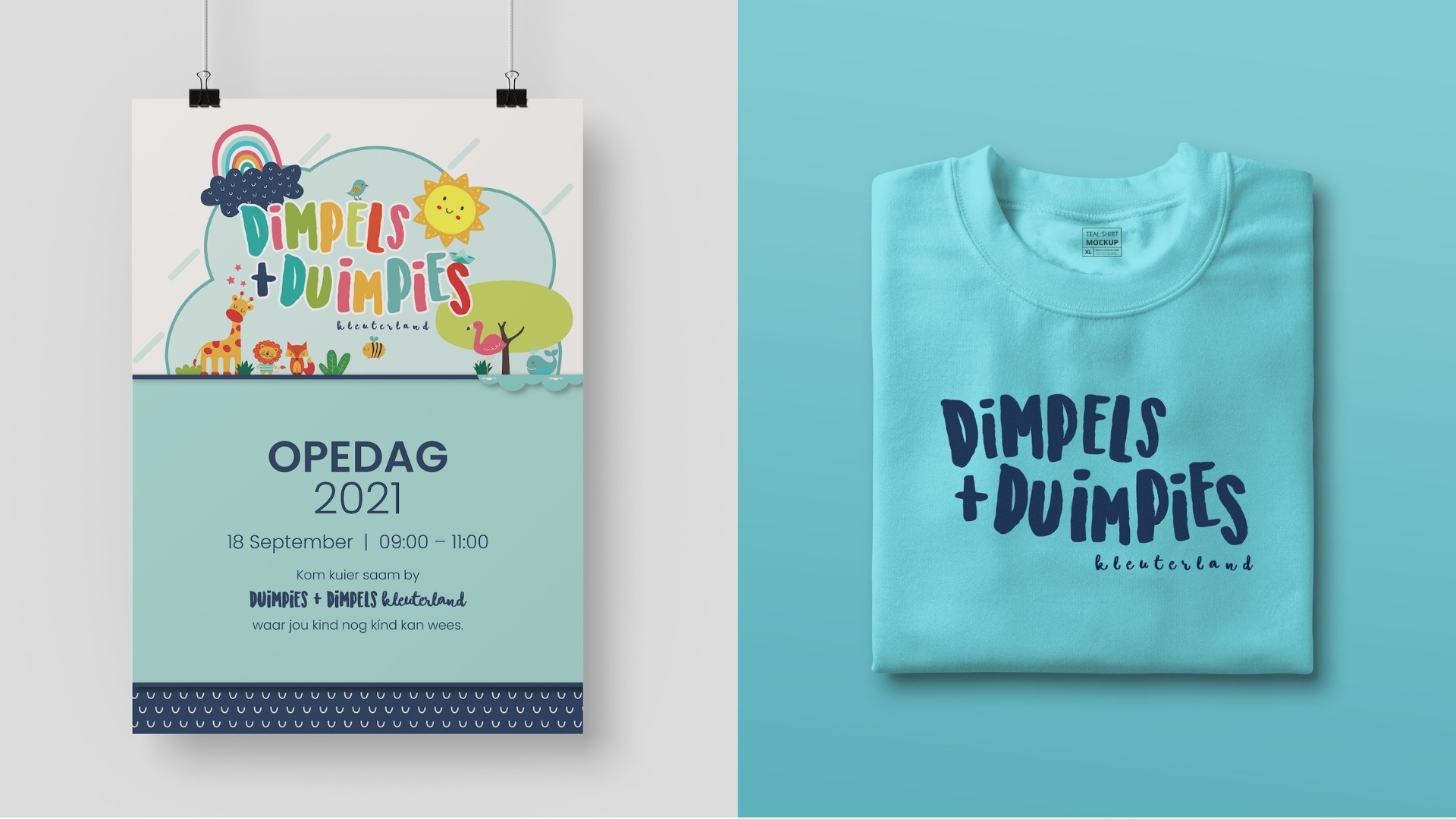
- Open day promotional materials
- Event poster design
- Branded merchandise concepts
- Brand application guidelines
The Outcome
The completed identity provided Dimpels + Duimpies with a professional yet playful brand presence that speaks directly to its target audience.
Every element of the brand works together to create recognition, consistency, and trust across both digital and physical touchpoints. Whether viewed on social media, promotional materials, event signage, or branded apparel, the identity remains instantly recognisable and uniquely its own.
Most importantly, the brand captures the joyful and nurturing experience that parents want for their children and that the school strives to deliver every day.
Why It Matters
Strong educational brands are built on more than logos. They are built on trust.
For schools, nurseries, and educational institutions, a cohesive brand identity helps create confidence, improve visibility, and strengthen connections with prospective families.
This project demonstrates Quantum Studios' ability to create complete brand ecosystems that combine strategic thinking, creative storytelling, and consistent visual design to help organisations build meaningful and lasting relationships with their audiences.