



Explore the full piece of work by clicking the images above.
Overview
Quantum Studios partnered with Kossie Sikelela Suid-Afrikaanse Huiskos to develop a distinctive visual identity that celebrates the warmth, heritage, and communal spirit of South African home cooking.
The objective was to create a brand that felt authentic, welcoming, and instantly recognisable while capturing the rich cultural influences that make South African food such a powerful connector of people, stories, and traditions.
The resulting identity balances contemporary design principles with culturally inspired visual elements, creating a brand that feels both familiar and unique.
The Challenge
Food brands compete in a crowded marketplace where visual identity often determines whether customers stop, engage, and remember.
For Kossie Sikelela, the challenge was to create a brand that reflected more than just food.
The identity needed to communicate:
- South African heritage
- Family and community
- Shared experiences
- Authentic home-cooked meals
- Warm hospitality
- Cultural pride
At the same time, the brand required enough flexibility to work consistently across packaging, signage, social media, marketing materials, merchandise, and future brand applications.
Our Approach
We began by exploring the emotional role that food plays within South African culture.
Rather than focusing solely on products or menus, we built the identity around the experience of gathering around a table, sharing stories, and creating memories through food.
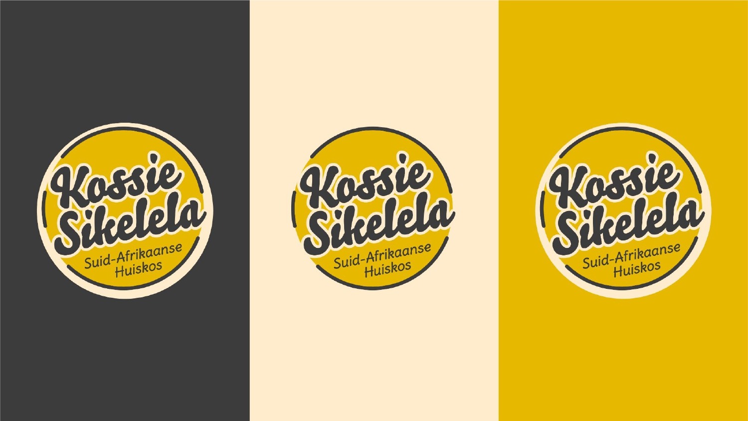
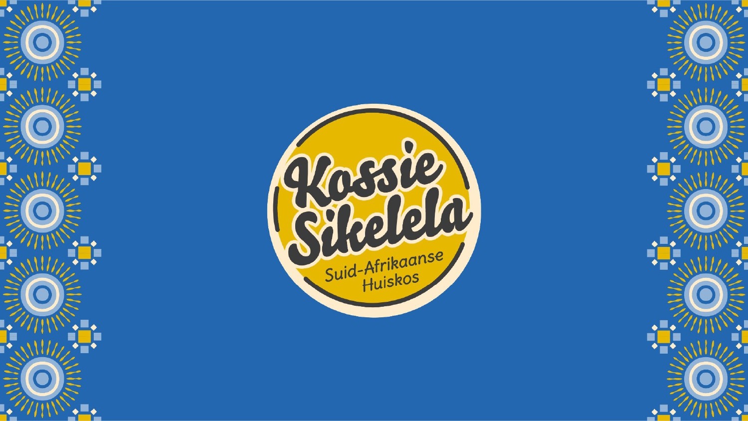
The logo was developed with a warm, approachable personality that reflects the welcoming nature of the brand while remaining highly recognisable and versatile across multiple applications.
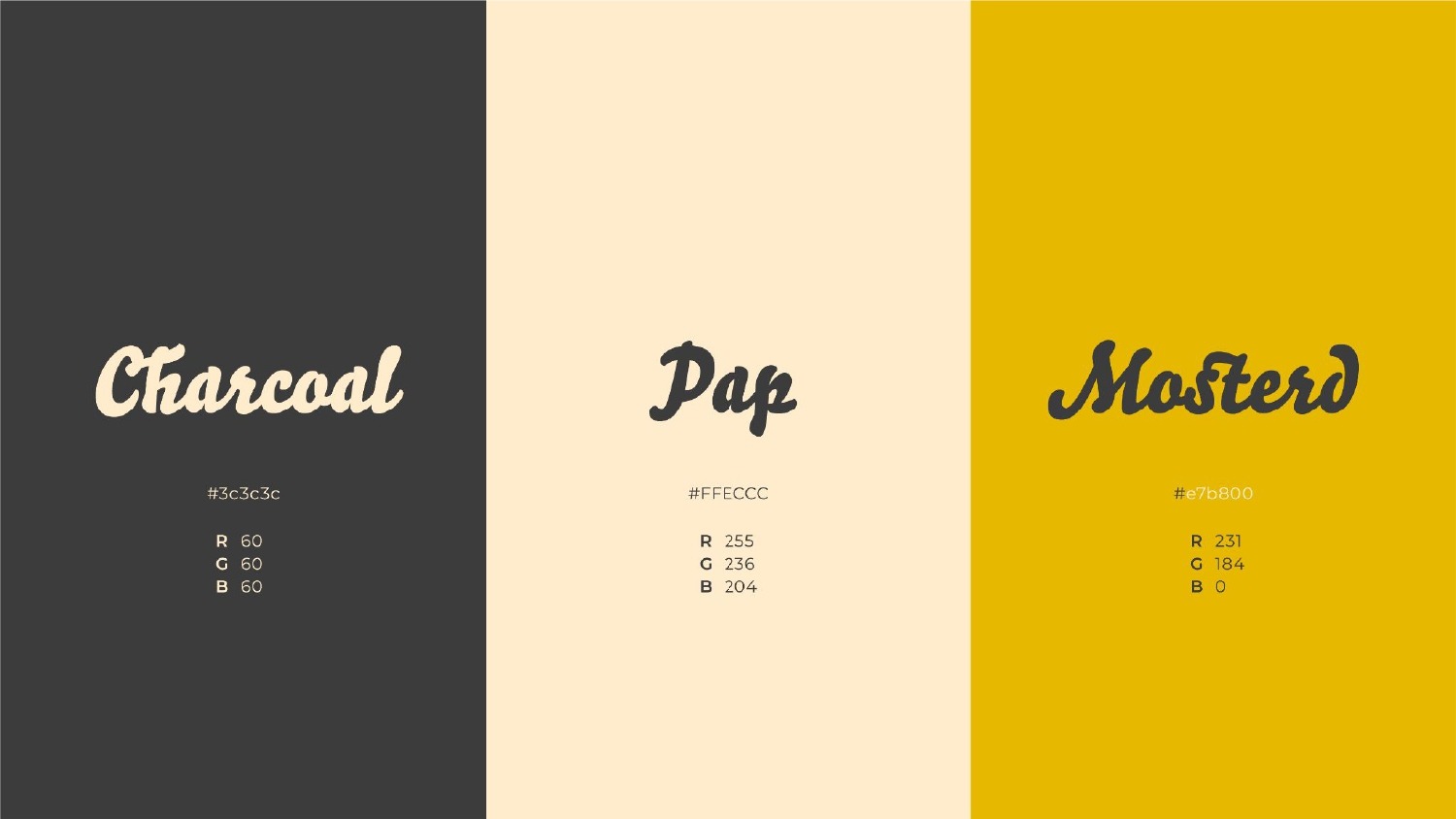
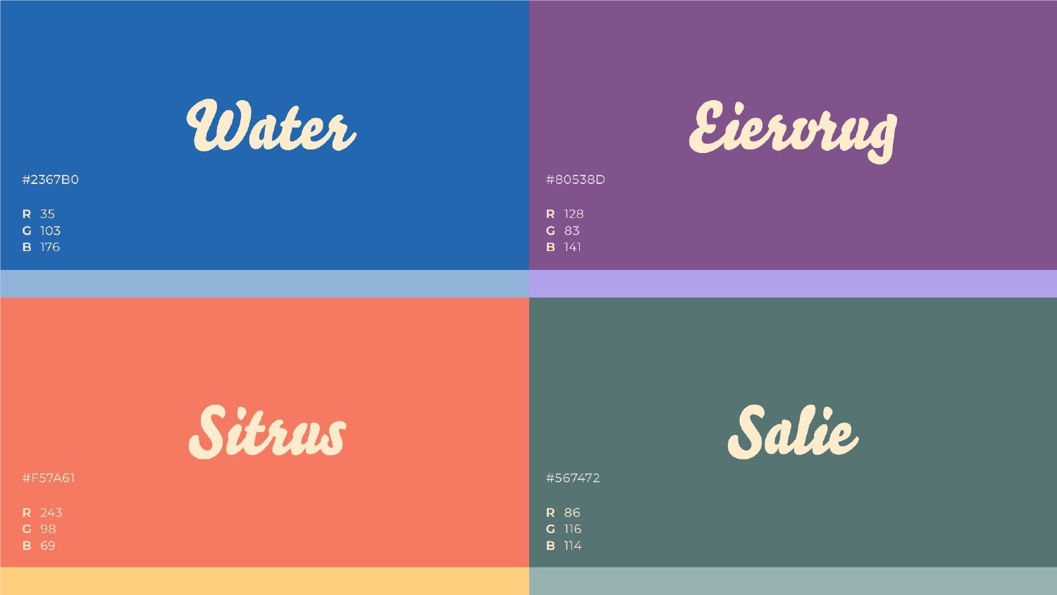
To reinforce the cultural positioning, we created a vibrant visual language using custom-inspired pattern systems, bold colour combinations, and typography that balances character with readability. The colour palette combines warm mustard tones with complementary accent colours including charcoal, blue, purple, coral, and sage green, creating a flexible identity capable of adapting across different touchpoints.
Custom graphic patterns were developed to create a unique visual signature for the brand, drawing inspiration from themes of community, culture, celebration, and shared experiences. These assets provide consistency while giving the brand a rich and memorable personality.
What We Delivered
- Brand identity development
- Logo design system
- Colour palette development
- Typography selection and hierarchy
- Custom pattern design
- Supporting graphic elements
- Brand asset creation
- Visual language development
- Brand application concepts
- Identity presentation and guidelines
The Outcome
The completed identity provides Kossie Sikelela with a bold and memorable brand presence that reflects its values, heritage, and personality.
Every element of the system works together to create a cohesive experience that feels welcoming, authentic, and unmistakably South African.
The result is a flexible identity capable of supporting future growth while maintaining strong visual recognition across every customer touchpoint.
Why It Matters
The most successful food brands do more than sell meals.
They create belonging.
A strong visual identity helps communicate culture, build recognition, and create emotional connections long before customers experience the product itself.
This project demonstrates Quantum Studios' ability to translate cultural stories, business objectives, and audience expectations into strategic brand systems that are visually distinctive, emotionally engaging, and built for long-term growth.