



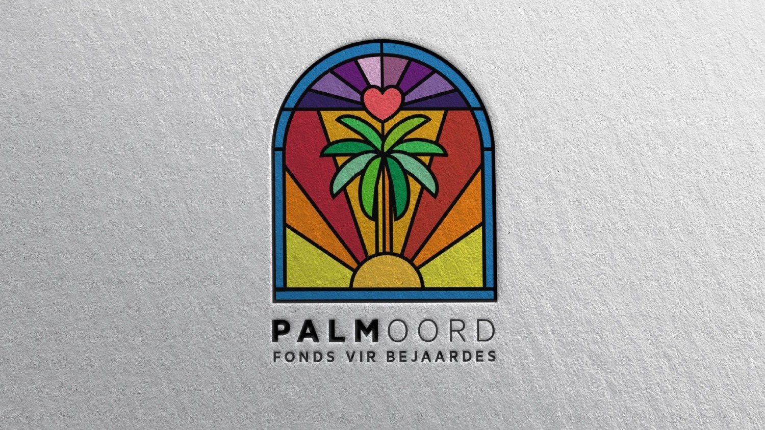
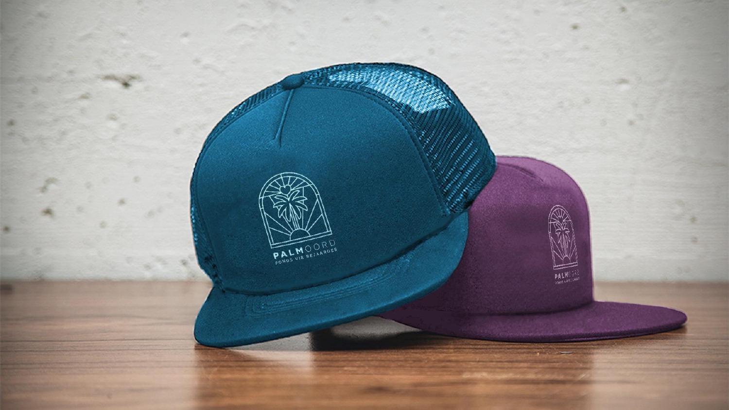
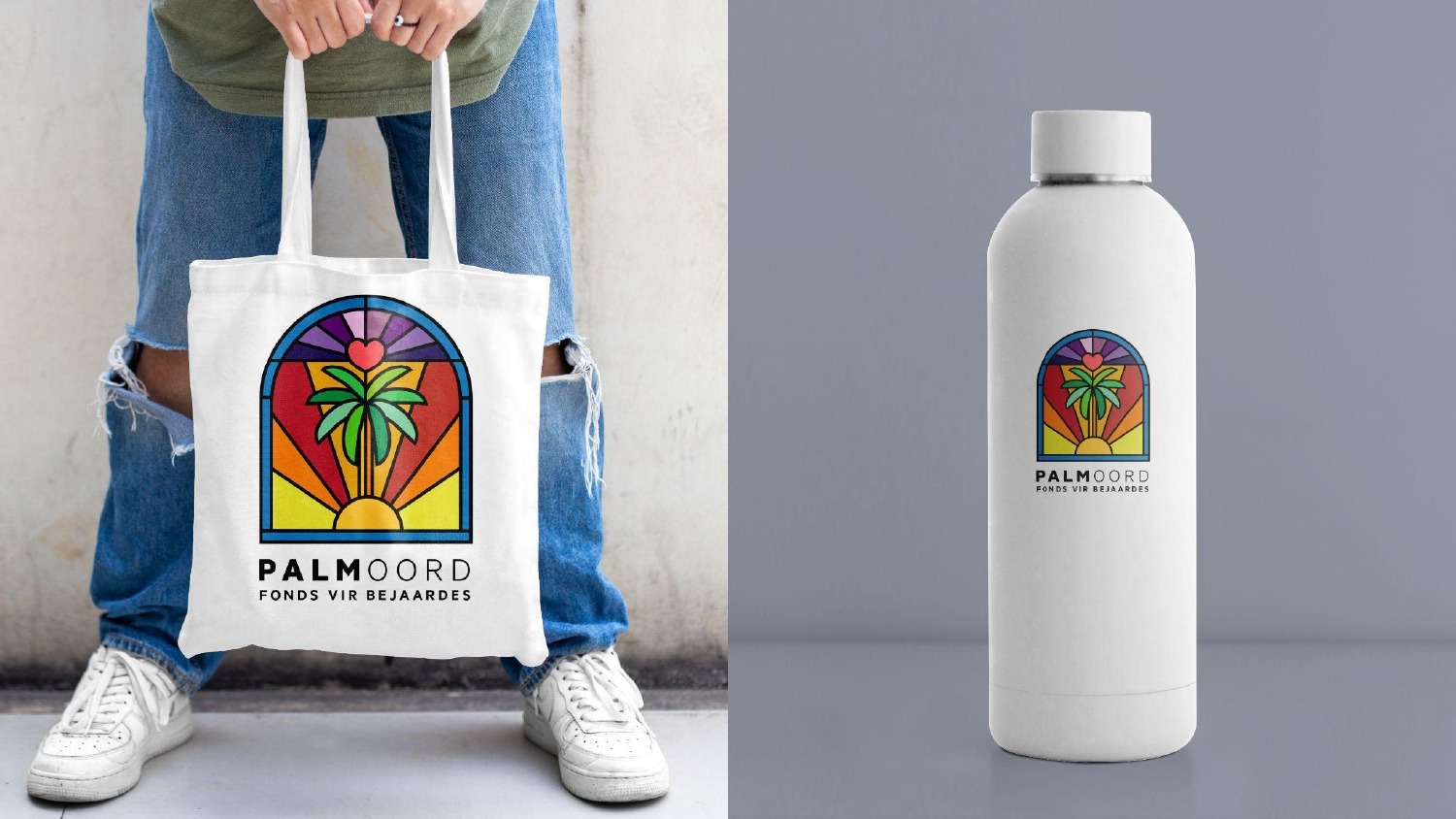
Explore the full piece of work by clicking the images above.
Overview
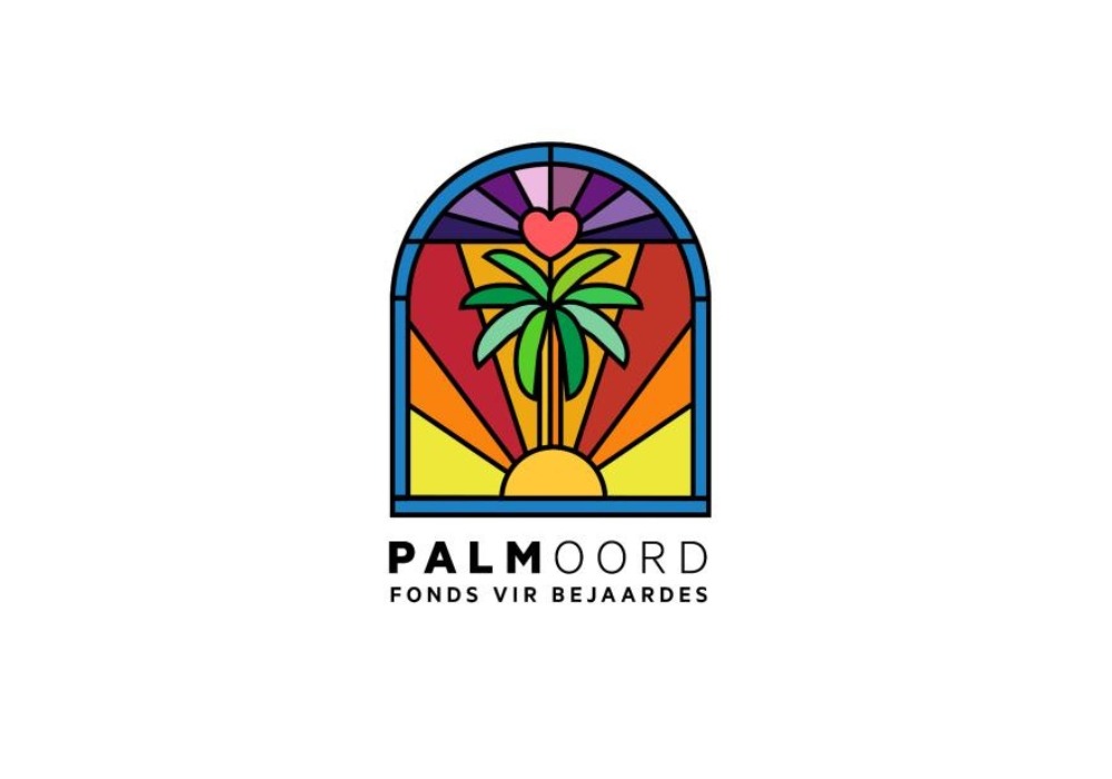
Palm Oord Fonds vir Bejaardes required a visual identity that reflected its mission of caring for elderly individuals while encouraging community involvement and support. The organisation needed a brand that balanced compassion, dignity, and hope while remaining distinctive and memorable across both digital and physical platforms.
The Challenge
Organisations operating within the elderly care and non-profit sector often face a common challenge: communicating an emotionally important mission without appearing outdated, generic, or disconnected from modern audiences.
Palm Oord needed a brand identity that could:
- Reflect its commitment to caring for elderly individuals
- Create emotional resonance with donors, volunteers, and supporters
- Stand out within the non-profit and social care sector
- Work consistently across campaigns, social media, merchandise, and printed materials
- Build trust while encouraging community participation
The organisation required more than a logo. It needed a visual system capable of supporting long-term awareness and fundraising efforts.
Our Approach
We approached the project by developing a brand identity rooted in symbolism, care, and connection.
The design process explored multiple creative directions, each centred around themes of support, compassion, growth, and community responsibility. Visual elements were carefully considered to ensure the identity communicated warmth and humanity while remaining professional and recognisable.
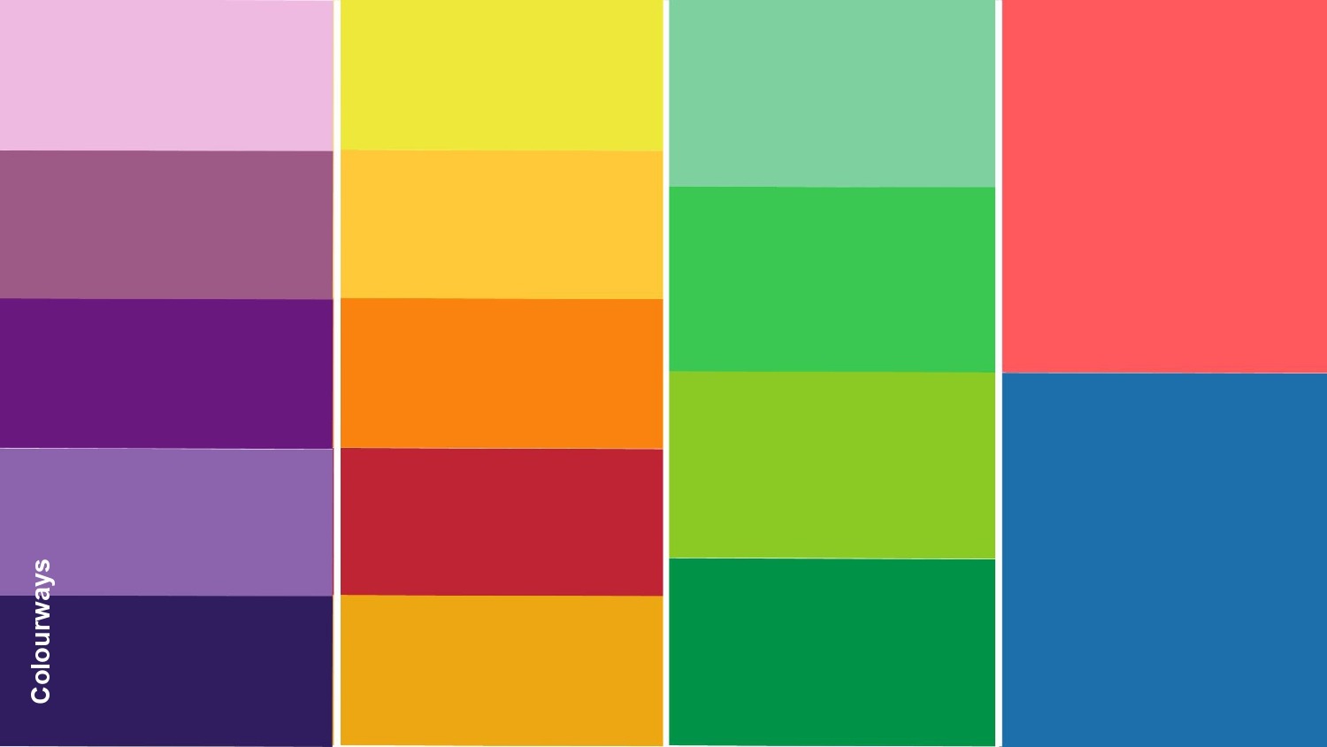
Colour psychology played an important role throughout the project. Bright yet balanced colour palettes were developed to represent hope, optimism, dignity, and care, helping the organisation create a stronger emotional connection with its audience.
Alongside logo development, we considered how the identity would function across real-world applications, ensuring consistency and flexibility across campaigns, promotional materials, and awareness initiatives.
What We Delivered
- Brand strategy and creative direction
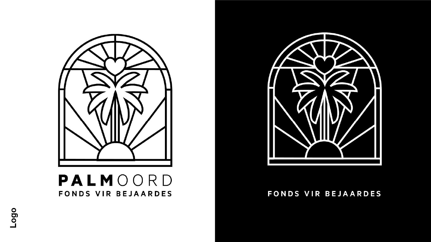
- Logo concept development and refinement
- Multiple visual identity routes
- Colour palette exploration and selection
- Typography recommendations
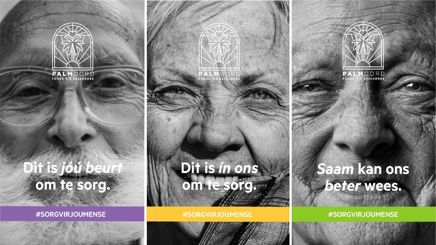
- Social media campaign concepts
- Awareness campaign visual assets
- Merchandise and promotional mockups
- Brand application guidelines for future communications
The Outcome
The final identity provided Palm Oord with a distinctive and meaningful visual presence capable of supporting both awareness and fundraising efforts.
The branding created a stronger emotional connection with audiences while helping position the organisation as a trusted advocate for elderly care. By combining clear symbolism with a vibrant visual language, the identity offers flexibility across future campaigns, community initiatives, donor engagement programmes, and marketing materials.
The result is a brand that feels approachable, compassionate, and memorable while remaining practical for long-term organisational growth.
Why It Matters
For organisations operating within the non-profit, charity, healthcare, and community support sectors, branding is not simply about appearance. It is about creating trust, communicating purpose, and inspiring action.
A strategically developed brand identity helps organisations connect with supporters more effectively, strengthen recognition, and build lasting relationships with the communities they serve. By aligning visual identity with organisational purpose, brands become more than logos. They become powerful tools for engagement, awareness, and impact.